To demonstrate three of our favorite ways to visualize data, we’ll use Nobel Prize data and earthquake data from our mapmaking friends at CartoDB. You can see how we made these in an IPython Notebook. Let us know if you’d like to use Plotly Enterprise on-premise.
![]()
We can use box plots to see the minimum, quartiles, and maximum of categories of data. We also get a side-by-side comparison. The box plot below shows the age of Nobel Prize winners by field. Ages are shown as dots beside the box, with outliers beyond the whiskers (e.g., a seventeen year old winner of the Nobel Prize). Here is a tutorial on box plots.
![<br>Age of Nobel Prize winners by field, 1901 to 2014]()
This box plot shows the magnitude of earthquakes over the past month; the dots beyond the whiskers are outliers. Hover your mouse to learn more.
![Earthquake Magnitude]()
A histogram shows bins of data. For example, we can see that there were 96 earthquakes with a 4.7 magnitude. There was one earthquake with a 7.3 magnitude. Do you recognize the outliers from our box plot?
![]()
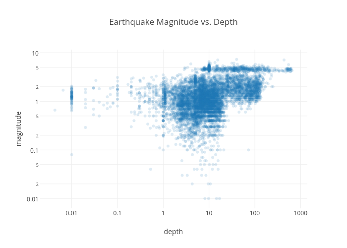
A logarithmic scale is great for showing a wide range of quantities. Each tick on the axis is the result of the previous mark multiplied by a value. A logarithmic scale on both axes is known as a log-log plot.
The log-log plot below shows earthquake magnitude (y-axis) and depth (x-axis). The x-axis goes from 100 to 200, 500, then 1,000. If you hover your mouse, you can see where each earthquake occurred.
![Earthquake Magnitude vs. Depth]()
To see a beautiful map of these earthquakes over time, head to CartoDB.
To create a box plot or histogram in Plotly, you can copy and paste data or upload data from Excel, Google Drive, or Dropbox. Then click the relevant columns. The same is possible from within the Plotly Excel Plugin. Within Plotly you can style, export, add a log axis, and control your bins.
![]()
![]()
![]()

Use Box Plots To See Minimum, Quartiles, & Maximum
We can use box plots to see the minimum, quartiles, and maximum of categories of data. We also get a side-by-side comparison. The box plot below shows the age of Nobel Prize winners by field. Ages are shown as dots beside the box, with outliers beyond the whiskers (e.g., a seventeen year old winner of the Nobel Prize). Here is a tutorial on box plots.

This box plot shows the magnitude of earthquakes over the past month; the dots beyond the whiskers are outliers. Hover your mouse to learn more.

Use Histograms To See Distributions Of Data
A histogram shows bins of data. For example, we can see that there were 96 earthquakes with a 4.7 magnitude. There was one earthquake with a 7.3 magnitude. Do you recognize the outliers from our box plot?

Show Orders Of Magnitude With Log Axes
A logarithmic scale is great for showing a wide range of quantities. Each tick on the axis is the result of the previous mark multiplied by a value. A logarithmic scale on both axes is known as a log-log plot.
The log-log plot below shows earthquake magnitude (y-axis) and depth (x-axis). The x-axis goes from 100 to 200, 500, then 1,000. If you hover your mouse, you can see where each earthquake occurred.
To see a beautiful map of these earthquakes over time, head to CartoDB.
Making Your Graphs
To create a box plot or histogram in Plotly, you can copy and paste data or upload data from Excel, Google Drive, or Dropbox. Then click the relevant columns. The same is possible from within the Plotly Excel Plugin. Within Plotly you can style, export, add a log axis, and control your bins.


